


Let's dive into the exciting world of Almost Dead™, a vibrant and daring beer brand, and explore the thrilling challenges of creating its visual identity! Whether it's Almost Dead™ or any other related brand, the journey of branding and design brings with it a delightful mix of hurdles and possibilities. But fear not, for I'm here to offer some considerations and potential solutions that will not only help you in your design projects but also keep the creative energy flowing!
Oh, and a friendly reminder: While we embark on this adventure, let's not forget that drinking is injurious to health. So, let's design responsibly and enjoy the process responsibly too!
Oh, and a friendly reminder: While we embark on this adventure, let's not forget that drinking is injurious to health. So, let's design responsibly and enjoy the process responsibly too!
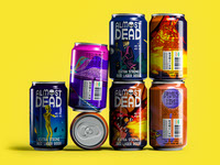
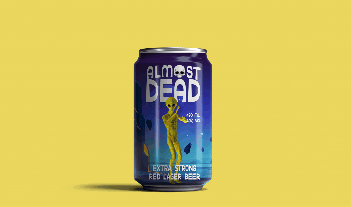
a) Brand personality and positioning: Almost Dead™ wants to convey a sense of exploration, curiosity, and unexpectedness. The visual identity should reflect these qualities through bold and vibrant design elements, typography, and color palettes. Solution: Create a visually striking logo and packaging design that captures the adventurous spirit of the brand, incorporating elements like constellations, starry skies, or abstract shapes that evoke exploration and discovery.
b) Differentiation: The beer market is highly competitive, and standing out is crucial. It's important to develop a visual identity that sets Almost Dead™ apart from other beer brands. Solution: Use bold and distinctive visual elements, such as unique typography, vibrant color combinations, or eye-catching patterns, to create a memorable and recognizable brand presence.
c) Beer style representation: Almost Dead™ focuses on lagers brewed with European hops, aiming for a sweet, crisp, and mellow taste. The visual identity should reflect the qualities and style of the beer. Solution: Incorporate visual elements that symbolize the European origin and brewing process, such as hop illustrations, barley motifs, or traditional brewing equipment, to establish a connection between the visual identity and the beer itself.
d) Target audience appeal: The visual identity should resonate with the target audience—curious and adventurous individuals seeking new experiences. Solution: Conduct market research to understand the preferences and visual aesthetics that appeal to the target audience. Use bold and energetic colors, dynamic layouts, and visually stimulating imagery to create an emotional connection with the audience.
As a designer, the goal in creating the visual identity for Almost Dead™ is to capture the essence of the brand's adventurous and exploratory spirit. Through vibrant and bold design elements, typography, and colors, the visual identity should evoke curiosity and create a lasting impression. By incorporating visual cues related to the beer's style and origin, such as hop illustrations and brewing equipment, the brand's authenticity and quality can be emphasized.
Keep up the incredible work, and don't forget to appreciate this project if you find the visual identity appealing. Together, let's continue designing and crafting an unforgettable experience! Cheers to creativity and responsible choices!